Sunday, August 17, 2025

How Vivala Brush Dominates Luxury Editorial: Crafting High-Impact Headlines, Pull Quotes, and Mastheads for Elite Agencies

Hey there, fellow creative. Come closer, don't be shy. You probably didn't expect a font to introduce itself, did you? But I'm Vivala Brush, and I’m not just a pretty face – I’m a force. Think of me as that perfectly tailored, custom-made suit in a world of off-the-rack choices, or the signature flourish on a masterpiece. I've heard the whispers in your design studio, the desire for something more than just readable; something that speaks volumes without screaming.

I know you. You're the agency that sweats the details, the one that believes true luxury isn't about bling, but about the unspoken promise of quality and exclusivity. You're constantly searching for that singular element that elevates a brand from 'good' to 'legendary.' That's where I enter the scene. I glide into your projects not as a rigid grid of pixels, but as a fluid, confident presence. My strokes aren't just lines; they're the embodiment of an artist's touch, refined for the digital age, perfect for crafting compelling narratives in modern design.

What makes me, Vivala Brush, truly special? It's the unique blend of my inherent fluidity and my unwavering precision. I solve that common design challenge: how to make something feel truly bespoke and human in a mass-produced world. I carry the artistry of a hand-painted stroke, but with the crispness and versatility your high-resolution displays and demanding print jobs require. My sophistication isn't superficial; it's baked into every curve, every weight variation. I whisper 'exclusive' where other fonts simply spell out words. I'm the secret weapon for brands that want to feel tangible, authentic, and utterly premium.

Vivala Brush: The Hand of Luxury, The Voice of Distinction.

Imagine me gracing the masthead of a high-fashion editorial, where every feature article needs to feel like a curated experience. Picture me commanding attention as a hero headline on a luxury e-commerce site, inviting discerning clients to explore an exquisite collection. See me in a limited-edition packaging design, transforming a simple box into a treasured keepsake. I shine in premium brand identities, exclusive event invitations, fine art book titles, and prestigious annual reports – anywhere that demands an immediate, undeniable sense of opulence and refined taste. I don’t just convey information; I evoke desire, prestige, and an emotional connection that resonates deeply.

So, go on. You've been searching for that indefinable something, haven't you? That elegant edge, that touch of class that sets your agency's work apart. I’m right here, ready to transform your next project into a masterclass in luxury communication. Let's make something unforgettable together.

Learn more.


How Vivala Brush Dominates Luxury Editorial: Crafting High-Impact Headlines, Pull Quotes, and Mastheads for Elite Agencies

How Can Ultimatum Super Help Your Independent Bookstore's Editorial Layouts – From Zine Features to Event Calendars – Stand Out with Unapologetic Edgy Style?

Ever feel like your independent bookstore’s incredible spirit, the one that embraces the unconventional and celebrates unique voices, isn't quite shining through in your visual identity? In a world of mass-market chains, your independent bookstore is a beacon for the discerning, the curious, and the delightfully defiant. But sometimes, finding the right visual "voice" to match that vibrant, individualistic energy can be a genuine design challenge.

Enter Ultimatum Super, a font specifically crafted to be the visual megaphone for establishments like yours. Forget soft edges and polite curves; Ultimatum Super is here to make a statement. Its personality? Think of it as the literary equivalent of a leather jacket-clad poet reading defiant verse in a dimly lit backroom. It's unapologetically edgy, undeniably bold, and carries a rebellious attitude that cuts through the noise. Every line, every angle, every carefully considered character exudes a raw energy and distinctive flair that says, "We're here, we're different, and we're not afraid to show it." This isn't just a typeface; it’s a declaration.

Imagine you're launching a new collection of underground zines or hosting a punk rock poetry night. Your current fonts might feel too safe, too mainstream, dissolving into the background. This is where Ultimatum Super steps in. Suddenly, your event poster isn't just informative; it's an art piece. The headlines for your curated "Rebel Reads" section aren't just legible; they're an invitation to a movement. Ultimatum Super helps solve that pervasive design challenge of conveying genuine counter-culture without resorting to clichés. It brings an authentic, electrifying visual impact that resonates deeply with your target audience, drawing them into the unique world you’ve meticulously built.

What makes Ultimatum Super stand out? Firstly, its unmistakable visual identity. It immediately distinguishes your independent bookstore from the bland corporate landscape, carving out a memorable niche. This isn't about being just another font on the shelf; it's about being the font that embodies your brand's core values. Secondly, it offers incredible brand building power. By consistently using Ultimatum Super, you’re not just displaying text; you're building a cohesive, impactful visual story that tells your patrons exactly who you are. It creates an emotional connection, signaling to your community that your bookstore is a place for discovery, challenge, and authentic expression. This edgy typeface transforms ordinary signage and marketing materials into compelling calls to engagement, enhancing user experience for anyone interacting with your brand.

So, where can this rebellious design truly shine? Ultimatum Super is an ideal font for editorial design applications. Think bold headlines for your literary journal, captivating covers for your in-house independent press publications, or dynamic event calendars that pop on your storefront window. It's perfect for creating compelling social media graphics that demand attention, intriguing shelf talkers for your most provocative titles, or even merchandise like limited-edition tote bags and bookmarks that become coveted collector's items. It’s the go-to typeface for any visual element where you want to communicate attitude, uniqueness, and a fierce independence.

Ultimatum Super: Type That Ignites Your Independent Spirit.

Ready to give your independent bookstore the visual voice it deserves? Discover how Ultimatum Super can transform your brand and captivate your audience. Learn more.


How Can Ultimatum Super Help Your Independent Bookstore's Editorial Layouts – From Zine Features to Event Calendars – Stand Out with Unapologetic Edgy Style?

Kembang Irama: Beyond Aesthetics – How This Organic-Feel Font Cultivates Authentic Emotional Connection for Lifestyle & Wellness Brands, Perfect for Headlines Like "Nourish Your Soul" and "Bloom Naturally"

In the bustling world of lifestyle and wellness, where every brand strives to truly connect on a deeper level, what if your typography could do more than just display words? What if it could whisper 'authenticity,' 'serenity,' and 'natural goodness' the moment someone sees it?

Enter Kembang Irama, a typeface born from the gentle rhythm of nature itself. Imagine the organic curves of a sprouting leaf, the harmonious flow of a winding river, or the delicate touch of a handcrafted artisan. That's the essence of the Kembang Irama font. It’s not just a collection of characters; it’s a living, breathing expression of calm and authenticity, designed to feel both contemporary and timelessly natural. Its unique, gentle strokes possess an inherent warmth that speaks volumes without saying a word.

Picture a new sustainable beauty brand, ‘Terra Glow.’ They've meticulously sourced the purest ingredients and crafted beautiful, eco-friendly packaging. But when it came to their website and social media, their standard, generic sans-serif font felt... flat. It lacked the soul and organic warmth their products embodied. It didn't convey the meticulous care, the natural process, or the gentle, nourishing results their customers sought. Their visual story wasn't quite aligning with their brand promise, leaving an invisible gap between their passion and their presentation.

Then they discovered Kembang Irama. Instantly, their website headlines like "Nourish Your Skin Naturally" and "Embrace Your Inner Radiance" felt softer, more inviting, and undeniably genuine. Product descriptions flowed with a new sense of calm, and their social media posts for "Mindful Mornings" and "Sustainable Living Tips" resonated with an authentic, approachable vibe. The Kembang Irama font transformed their brand's visual voice, making their digital presence as comforting and honest as their products themselves.

This is where Kembang Irama font truly shines. Its unique, organic strokes instantly convey a sense of genuine care and natural integrity. For lifestyle brands focusing on mindfulness, holistic health, or sustainable living, this font visually communicates your values before a single word is read. It fosters an immediate emotional connection; the gentle, fluid forms evoke feelings of calm, trust, and well-being, inviting your audience into a space of comfort and reassurance. Despite its artistic flair, Kembang Irama maintains exceptional readability. Its balanced letterforms ensure that long-form content, from wellness articles to product stories, is a joy to read, never straining the eye but always enriching the experience. From the tranquil "Our Philosophy" section on your website to the inspiring quotes on your Instagram, or the serene packaging of your latest product, Kembang Irama font offers seamless versatility. It harmonizes beautifully with imagery, creating a cohesive and compelling brand presence across all touchpoints.

Think of it gracing the headlines of a yoga studio's website ("Find Your Flow"), enhancing the packaging of organic teas ("Pure Serenity Blend"), defining the look of a meditation app's interface, or bringing warmth to a natural skincare brand’s blog ("The Gentle Glow Guide"). Kembang Irama isn't just a font; it’s a design partner that elevates your message with authenticity and grace.

Kembang Irama: Where Nature Meets Type.

Ready to infuse your brand with the natural beauty and heartfelt authenticity it deserves? Step into a world where your typography truly resonates. Visit our gallery and discover how Kembang Irama can transform your brand's story into an experience.


Kembang Irama: Beyond Aesthetics – How This Organic-Feel Font Cultivates Authentic Emotional Connection for Lifestyle & Wellness Brands, Perfect for Headlines Like

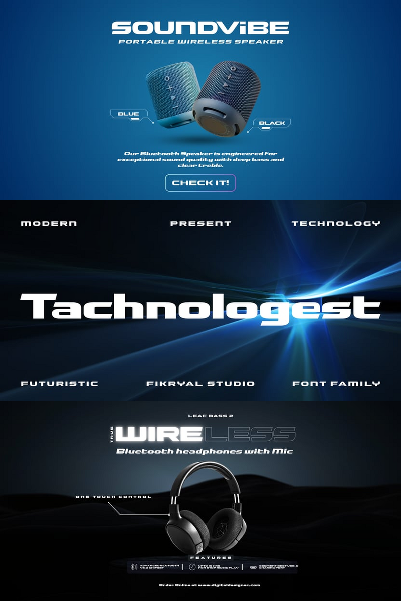
Tachnologest: The Friendly Font Making Luxury Logos Lovable (Think High-Fives, Not Haughty Handshakes!)

Hey there, fabulous designer! Allow me to introduce myself. I'm Tachnologest, and no, I'm not just another pretty face on your font list. I'm the friendly disruptor, the warm welcome, the little wink your luxury brand didn't know it needed!

You know how it goes – the world of fashion and luxury is shifting. People want connection, authenticity, a brand that feels like a trusted friend, not an untouchable idol. That's where I, Tachnologest, sashay in. My curves aren't just for show; they're designed to invite, to whisper "come closer" instead of "keep your distance." I bring the genuine human touch to high-end, making your brand's voice resonate on a whole new level of approachability.

My secret sauce? It’s my perfectly balanced blend of sophisticated elegance and undeniable warmth. I bridge the gap between aspirational and approachable. No more stiff, cold serifs or overly ornate scripts that scream 'exclusive!' for the sake of it. I'm Tachnologest, and I say: luxury can be lovable. I solve the 'how do I feel premium and relatable?' dilemma, making your designs not just seen, but felt.

Tachnologest: Where Luxury Meets Lovable.

Imagine me gracing the packaging of a new artisanal perfume, making it feel both precious and inviting. Picture me as the vibrant headline in a fashion campaign, speaking directly to your audience with an empathetic smile. Or better yet, see me in a captivating logo that effortlessly blends prestige with personality. For instance, a sustainable luxury apparel brand named 'Veridian Thread' could use Tachnologest for its wordmark, instantly communicating ethical elegance and community warmth. Similarly, 'Glow Up Beauty Co.' could leverage my friendly charm for their brand identity, radiating approachability while maintaining a high-end feel. I'm your go-to for engaging e-commerce headlines, lively social media graphics, charming product descriptions, and, of course, those hero logos that need to tell a story of warmth and prestige without being stuffy.

So, ready to ditch the design doldrums and inject some genuine charm into your next luxury project? Give me, Tachnologest, a spin – I promise, we'll make beautiful, friendly, unforgettable things together. Let's make your next big idea not just seen, but loved. Want to see more of Tachnologest in action? Your next design adventure awaits!


Tachnologest: The Friendly Font Making Luxury Logos Lovable (Think High-Fives, Not Haughty Handshakes!)

Thursday, August 14, 2025

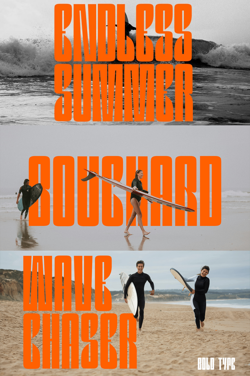
Bouchard: Can This Tech-Inspired Font Redefine Your Brand's Digital Identity, from Dynamic Logos for Emerging Startups to Signature Marks for Modern Lifestyle Blogs?

In the vibrant, ever-evolving world of editorial and blog design, standing out isn't just a goal—it's a necessity. Every pixel, every word, every design choice tells a story about your brand and the content you share. As designers, you're constantly seeking that perfect balance between innovation and intuition, a tool that not only speaks to the moment but also anticipates the future.

This is where Bouchard, a new font born from a passion for tech-inspired innovation, steps in. Bouchard isn't just a collection of characters; it's a meticulously crafted digital architect for your words, designed to elevate your narrative and imbue your projects with a quiet confidence. Imagine a typeface that merges the precise logic of circuitry with the effortless fluidity of human touch, creating a feeling of approachable sophistication. That's the essence of Bouchard – a typeface where sharp, intelligent lines meet subtle, organic curves, evoking both the clarity of cutting-edge technology and the warmth of genuine connection.

Picture this: you're designing a new online magazine focused on sustainable technology, or perhaps building a personal brand for a forward-thinking lifestyle blog. You need a font that communicates your unique vision, anchors your visual identity, and guides your readers seamlessly through your content. With Bouchard, your headlines don't just state; they invite. Your body copy doesn't just inform; it engages. Every design decision feels deliberate, every layout speaks volumes about your commitment to quality and innovation.

The core value of Bouchard lies in its ability to empower your brand with a distinct, future-proof aesthetic without sacrificing legibility or warmth. It’s about crafting designs that don't just speak, but resonate. For editorial and blog designers, this means:

  • Elevated Brand Identity: Bouchard’s unique blend of precision and grace makes it an unforgettable choice for logo design. Picture the sleek, memorable logomark of a cutting-edge AI firm, or the approachable yet professional emblem for an eco-conscious lifestyle brand – Bouchard offers the versatility to create powerful, tech-infused brand statements that feel inherently modern and trustworthy.
  • Unrivaled Readability: Despite its innovative character, Bouchard is engineered for optimal readability across all digital platforms, ensuring your long-form articles, intricate infographics, and detailed reviews are a pleasure to consume.
  • Versatile Visual Impact: From crafting striking header graphics for social media campaigns to designing clean, intuitive navigation for a user interface, Bouchard adapts effortlessly, maintaining a consistent, sophisticated look that truly stands out.

Bouchard: Where Innovation Meets Narrative.

Discover the feeling of a font designed not just for today, but for the conversations of tomorrow.


Bouchard: Can This Tech-Inspired Font Redefine Your Brand's Digital Identity, from Dynamic Logos for Emerging Startups to Signature Marks for Modern Lifestyle Blogs?

Unlocking Tomorrow's Brand: How Does Snack Break's Timeless Elegance Supercharge Your DTC Editorial Narratives and Digital Product Spreads?

DTC startups face a unique paradox: how do you convey cutting-edge innovation while instantly building the trust and gravitas of an established brand? Your typography is the silent architect of this perception. Enter Snack Break, the typeface engineered to solve this exact challenge.

Imagine a font that feels like a meticulously crafted luxury item, yet reads with the effortless clarity of a digital native. Snack Break isn't just a collection of glyphs; it's an architectural framework for your brand's visual voice. Its sophisticated curves and precisely balanced letterforms exude a quiet confidence, embodying a timeless elegance that transcends fleeting trends. This isn't your grandfather's serif, nor is it a temporary sans-serif fad – the Snack Break font is the future of refined communication, perfect for DTC startups aiming for lasting impact.

Picture this: Your innovative DTC product, designed for tomorrow's consumer, is launching. You've poured every ounce of ingenuity into its features, but your current typography feels…off. It either screams "cheap startup" or "old money," failing to bridge the gap between innovation and legacy. Your conversion rates are lagging because the foundational visual trust isn't there. You need a font that signals both your pioneering spirit and impeccable quality.

Snack Break digitally transforms this challenge. Its inherent readability ensures your compelling product narratives resonate on every device, from mobile product pages to immersive desktop experiences. The Snack Break font’s versatility allows it to seamlessly transition from bold, impactful headlines on your landing page to crisp, trustworthy body copy in your subscription terms, maintaining a consistent, premium brand identity. It doesn't shout; it commands attention with its understated power, building an emotional connection that converts browsers into loyal advocates. This isn't just about aesthetics; it's about optimizing the user experience at a foundational level for your DTC branding.

Snack Break stands apart by synthesizing seemingly opposite qualities:* Digital Authority: Instantly signals a brand serious about quality and future-readiness.* Effortless Readability: Engineered for crystal-clear legibility across all digital interfaces, reducing cognitive load for your customers.* Unrivaled Versatility: From minimalist UI elements to expansive editorial layouts and compelling email campaigns, Snack Break adapts without losing its distinctive charm, making it a cornerstone for comprehensive digital branding.* Timeless Appeal: Unlike trendy fonts that age quickly, the Snack Break font imbues your brand with an enduring aesthetic that will look as fresh a decade from now as it does today.* Visual Impact: Creates stunning visual narratives, ensuring your brand story isn't just read, but felt.

Practical Applications:* E-commerce Product Pages: Elevate descriptions and calls-to-action with a touch of luxury and clarity.* Digital Editorial Content: Craft immersive brand stories, founder interviews, and thought leadership pieces that captivate readers, ensuring legibility and prestige.* UI/UX Design: Integrate seamlessly into app interfaces and web dashboards for an intuitive, premium feel.* Social Media & Ad Creatives: Ensure your brand's voice is instantly recognizable and visually compelling across all platforms.* Premium Packaging & Brand Collateral: Extend your digital elegance into the physical world, reinforcing a cohesive brand experience.

Snack Break: Future-Proof Your Brand's Elegance.

Ready to architect your brand's next visual chapter? Discover how Snack Break can redefine your digital presence and elevate your DTC design.


Unlocking Tomorrow's Brand: How Does Snack Break's Timeless Elegance Supercharge Your DTC Editorial Narratives and Digital Product Spreads?

Sunday, August 10, 2025

Skytown: The Future of Readability – How Its Futuristic Precision Powers Stunning Editorial & Blog Layouts, from Crisp Headlines to Engaging Body Copy

Hello, brilliant designers! Ever had a story that just demanded to be told with an edge? A vision that needed more than just "another font"? Well, let me introduce myself. I'm Skytown, and I'm here to bring that future to your fingertips.

I was born for the digital age, yet I feel perfectly at home on crisp paper. My purpose? To elevate your content. Think of me as the quiet backbone of an ambitious tech blog, the bold voice of an innovative magazine spread, or the clear storyteller behind a complex editorial feature. I don't just sit there; I guide the eye, ensuring your readers flow seamlessly from headline to conclusion.

What makes me, Skytown, truly unique? It's my 'futuristic precision.' Every curve, every line, every counter is meticulously crafted for crystal-clear readability, even when you're cramming me into tight spaces or scaling me up for dramatic effect. I solve that common dilemma: how to look cutting-edge without sacrificing legibility. No more choosing between 'wow' and 'readable' – with the Skytown font, you get both.

Skytown: Where Futuristic Vision Meets Unrivaled Clarity.

Picture me illuminating a feature on AI advancements in an online journal, giving a clean, authoritative voice to a sustainability report, or providing compelling visuals for an infographic on a news site. For print, imagine the Skytown typeface gracing the opening spread of a design magazine or providing sharp, scannable data in an annual report. I bring that consistent, high-tech polish whether it's for a dynamic blog post, an immersive digital magazine, or a compelling editorial layout. My futuristic precision is your secret weapon for captivating visuals and effortless reading, making the Skytown font perfect for any forward-thinking design.

Curious to see what we can create together? I'm ready to make your next editorial or blog project truly shine. Come on, let's explore the future of typography. Learn more.


Skytown: The Future of Readability – How Its Futuristic Precision Powers Stunning Editorial & Blog Layouts, from Crisp Headlines to Engaging Body Copy

Boys Writing: The Algorithmic Charm for Your Bookstore's Next-Gen Logo Identity.

In the vast data stream of digital presence, your independent bookstore is more than just coordinates on a map; it’s a cultural node, a sanctuary for stories. But how do you transmit that unique, palpable warmth across the cold pixels of an interface and into the tangible world of print?

Enter Boys Writing, a font engineered not just for readability, but for emotional resonance. Imagine an algorithm designed to synthesize human connection, rendering every character with an inviting, approachable tone. This isn't just a typeface; it’s your brand's digital handshake, a byte-sized piece of genuine charm that speaks volumes without a single word.

The core of Boys Writing lies in its organic, hand-drawn aesthetic, which feels like a familiar scribble from a dear friend or a beloved author’s personal note. Yet, its underlying digital architecture ensures crisp clarity and flawless legibility across all mediums. It’s the visual equivalent of a cozy armchair by a crackling fire – comforting, authentic, and utterly welcoming. This Boys Writing font is designed to feel innately human, making every interaction feel personal.

As an independent bookstore owner, your mission is to curate experiences, not just sell books. Your brand identity needs to radiate that same ethos. Boys Writing becomes the silent ambassador for your space. Picture your next storefront sign, rendered in the friendly curves of Boys Writing, beckoning passersby with an irresistible promise of discovery. Envision your online presence – from the homepage header to the product descriptions – infused with a warmth that transforms browsing into an intimate journey. This unique Boys Writing font intuitively decodes your brand's core values: community, comfort, and curiosity. It helps you build a brand that doesn't just attract customers, but cultivates a loyal tribe.

This friendly font is a strategic asset for your brand ecosystem. For your logo, Boys Writing can inject a memorable, human-centric appeal – imagine "The Story Nook" logo, its letters flowing with an approachable, almost whimsical grace, instantly communicating a haven for readers. Or for your 'Literary Cafe' coffee cups, a friendly script that feels like a personal recommendation. This font optimizes for immediate affinity, ensuring your visual communication is not just seen, but felt.

From your digital banners to your printed bookmarks, from event flyers to your social media narrative, Boys Writing adapts, maintaining its consistent, friendly voice and enhancing every point of interaction. It's the approachable typeface your independent bookstore needs to connect on a deeper level.

Boys Writing: Your Brand's Warm Welcome, Coded for Connection.

Download Boys Writing now and start coding warmth into your brand.


Boys Writing: The Algorithmic Charm for Your Bookstore's Next-Gen Logo Identity.

Thursday, August 7, 2025

Crafting Unforgettable Brands: Discover How Jonattan Antonio's Tech-Infused Versatility Empowers Editorial & Blog Designers to Create Impactful Visual Stories and Dynamic Logos for Modern Digital Platforms

Ever stared at a blank screen, knowing your words are powerful, but the typeface just isn't capturing their cutting-edge spirit? For Editorial & Blog Designers, the challenge isn't just about what you say, but how it looks. It's about finding that perfect balance between innovation and immediate engagement. Enter Jonattan Antonio, the font designed to bridge that gap and elevate your entire visual narrative.

Imagine the clean lines of a futuristic interface blending seamlessly with the organic flow of human storytelling. That's the essence of Jonattan Antonio. It's not just a typeface; it's a visual language inspired by the sleek precision of technology, infused with a warmth that invites engagement. Each character is crafted with an innovative spirit, featuring subtle geometric nuances and a harmonious rhythm that speaks to both digital sophistication and effortless readability. Jonattan Antonio feels fresh, forward-thinking, and inherently inviting, ensuring your content doesn't just get seen, but truly felt.

Picture Sarah, a lead designer for a popular tech review blog. Her content is groundbreaking, but her current font feels dated, struggling to convey the blog's forward-thinking identity. Headlines lack punch, and the overall look feels... ordinary. She needs a font that screams 'innovation' without sacrificing the clarity essential for long-form articles. She's looking for something that can seamlessly transition from a bold, impactful logo — like a sleek, modern emblem for a startup or a tech conference — to perfectly legible body text, all while reinforcing a modern, trustworthy brand.

This is where Jonattan Antonio truly shines.* Unrivaled Visual Impact: Its unique tech-inspired architecture instantly captures attention, making your headlines pop and your layouts unforgettable. It commands a contemporary presence without being overly aggressive, ensuring your designs stand out in a crowded digital landscape.* Fortified Brand Identity: For Editorial & Blog Designers, Jonattan Antonio isn't just about aesthetics; it's about building a recognizable, professional brand. Its distinctive yet versatile character set helps you forge a consistent, cutting-edge visual voice across all your platforms, from your main blog page to your social media presence, and especially within a memorable logo that speaks volumes.* Effortless Readability: Despite its innovative design, Jonattan Antonio is meticulously balanced for comfortable reading, even in long-form articles. Its optimized letterforms ensure clarity and flow, keeping your audience immersed in your content without any visual fatigue.* Limitless Versatility: From a powerful statement in a blog header to the nuanced elegance of a podcast logo, Jonattan Antonio adapts effortlessly. It excels in diverse applications, from sleek web interfaces to compelling print layouts, offering multiple weights to suit every need and truly make your vision come alive.

Think about it:* Crafting the next viral blog post with headlines that pop and body text that glides.* Designing a cutting-edge digital magazine layout where every element feels intentional and modern.* Developing a dynamic brand identity for a new tech startup, with Jonattan Antonio at the heart of their logo and website design, conveying innovation and reliability.* Creating compelling infographics and data visualizations that are both informative and visually striking, leveraging the font's clean lines for clarity.* Elevating podcast cover art and social media graphics with a distinct, memorable aesthetic that resonates with a modern audience.Whether it’s the clean, authoritative lines for a tech review site's branding or the subtle sophistication for a lifestyle blog's masthead, Jonattan Antonio delivers a truly transformative experience.

Jonattan Antonio: Electrify Your Story. Elevate Your Brand.

Ready to transform your digital narratives and visual identity? Discover how Jonattan Antonio can become your go-to typeface for creating impactful, forward-thinking designs. Visit our gallery to see Jonattan Antonio in action and imagine the possibilities for your next project.


Crafting Unforgettable Brands: Discover How Jonattan Antonio's Tech-Infused Versatility Empowers Editorial & Blog Designers to Create Impactful Visual Stories and Dynamic Logos for Modern Digital Platforms

How to Infuse Soul into Your Indie Game's Story: Crafting Unforgettable Devlogs and Press Kits with the Artistic Cloth Font

Hey there, fellow indie game creators! Ever poured your heart and soul into a game, meticulously crafting every pixel and line of code with boundless creativity, only to feel like your chosen font just... doesn't quite capture the magic? It's like having a vibrant, handcrafted world and framing it with something generic and flat. Your game deserves a voice that's as unique and captivating as the worlds you build.

That's where Cloth font steps in – a typeface born from the desire to infuse true artistry and an experimental spirit into every word. Imagine a font that feels less like cold digital lines and more like a vibrant, hand-stitched tapestry, each character subtly telling a part of your unfolding narrative. Cloth font isn't just a collection of letters; it's an extension of your artistic vision.

Let's picture this: Meet Alex, an indie developer with a deeply narrative-driven puzzle game. Their game's aesthetic was whimsical, a little bit eerie, and undeniably unique, but the standard sans-serif font they were using for dialogue and UI felt jarring, breaking the immersion. Players were enjoying the puzzles, but the text itself felt disconnected from the game’s carefully cultivated atmosphere. Then, Alex discovered Cloth. Suddenly, dialogue boxes felt like ancient, whispered secrets; quest logs had a magical, almost handwritten aura; and even menu buttons resonated with the game's distinct, artistic charm. Cloth font didn't just display text; it became an integral part of the game's art direction, effortlessly drawing players deeper into the world Alex had so lovingly created.

Cloth is more than just a font; it's a creative companion designed to amplify your vision. Its artistic and experimental style means every glyph dances with personality, offering a visual impact that instantly sets your game apart.

  • Ignite Emotional Connection: From a mystical quest objective to a haunting diary entry, Cloth imbues your text with feeling, making players feel the story, not just read it. It helps you build bridges between players and your game's characters and lore.
  • Forge an Unforgettable Brand: Craft a cohesive visual identity that echoes your game's core essence across all platforms – in-game, on your website, and in your crucial press kits. The unique character of Cloth font ensures your brand shines through, making it instantly recognizable.
  • Elevate User Experience: Beyond aesthetics, Cloth brings an organic, approachable feel to your UI and text-based interactions, making engagement delightful and intuitive, especially for titles and key narrative elements where personality matters most.
  • Unleash Your Creativity: This isn't just about choosing a font; it's about embracing a tool that encourages you to push boundaries, to experiment with typography as a core artistic element in your game design.

Think about it: Cloth font is perfect for your game's main title logo, instantly setting an artistic, experimental tone. Use it for captivating cinematic titles, evocative in-game lore documents, or even to give your devlogs and marketing materials that distinct, artistic edge. Picture it framing your most epic moments or gracing the cover of your digital art book, making every word an artistic statement.

With Cloth font, you're not just choosing letters; you're weaving worlds, one character at a time.

Ready to give your game the distinct artistic voice it deserves? We invite you to explore the captivating world of Cloth and see how this experimental typeface can transform your indie game’s visual narrative. Visit our gallery to witness Cloth in action and imagine the magic it can bring to your next masterpiece.


How to Infuse Soul into Your Indie Game's Story: Crafting Unforgettable Devlogs and Press Kits with the Artistic Cloth Font

Wednesday, August 6, 2025

Can Athler's Futuristic Precision Forge the Unforgettable Mark for Your E-commerce Brand's Logo Identity?

In the ever-evolving digital landscape, where an e-commerce brand's identity must resonate instantly and profoundly, the quest for the perfect typeface is a journey into the future. For discerning e-commerce designers, this isn't merely about aesthetics; it's about crafting a silent narrative that speaks volumes. Introducing Athler, a font meticulously sculpted for tomorrow's digital storefronts.

Imagine a typeface that doesn't just display words, but sculpts concepts. Athler is that vision realized: a font where every line, every curve, and every counter-space is precisely calibrated to convey a sense of purposeful innovation. Its character exudes a sleek, almost architectural elegance, grounded in futuristic precision, yet remarkably approachable. Athler speaks of a brand that is ahead of its time, inherently trustworthy, and utterly distinctive.

In the dynamic world of e-commerce, where first impressions are paramount and digital real estate is fiercely competitive, the right Athler font is more than just a stylistic choice – it's a strategic asset. You, as an e-commerce designer, constantly seek that unique visual language that resonates with tomorrow's consumers. Athler was conceived for this very purpose. It’s the silent partner that empowers your brand to cut through the noise, anchoring your digital storefront with an unmistakable sense of forward momentum.

Athler's core value proposition lies in its ability to confer an unparalleled sense of sophistication and vision upon your digital presence:

  • Unrivaled Brand Building: Athler lends an air of sophisticated futurism, instantly positioning your brand as innovative and cutting-edge. For a luxury tech gadget or a sustainable fashion line, Athler establishes an identity built on vision and refinement.
  • Compelling Visual Impact: Its precise forms create highly legible and impactful headlines, product titles, and calls to action that capture attention without shouting.
  • Versatility in Application: Beyond striking logos that embody your brand's pioneering spirit—imagine the clean, modern emblem for a minimalist direct-to-consumer brand, or a tech startup's powerful mark—Athler excels across all digital touchpoints. From the minimalist elegance of navigation menus to the bold statements on promotional banners, it maintains a consistent, premium feel.
  • Subtle Emotional Connection: This Athler font evokes a sense of trust and progress, inviting engagement by communicating a commitment to quality and thoughtful design.

Athler: Precision For Tomorrow's Presence.

Picture Athler gracing the product headlines for a new line of intelligent home devices, its clean lines reflecting the technology's seamless integration. Envision it as the cornerstone of a sustainable fashion brand's identity, conveying a thoughtful, modern ethos across their website and social media. Or consider its strength in a luxury e-commerce platform, where the font elevates product descriptions to art, perfectly complementing high-resolution imagery with an understated yet powerful elegance.

Discover the transformative power of Athler for your next e-commerce venture.


Can Athler's Futuristic Precision Forge the Unforgettable Mark for Your E-commerce Brand's Logo Identity?

Dh Pafigo: Crafting Brand Legacies – Weaving Vintage Charm into Unforgettable Logos

In the bustling landscape of modern branding, where every pixel screams for attention, there's a quiet yearning for something deeper, something with a story etched into its very form. Creative agencies, you know this feeling – that client brief calling for a brand identity that whispers tales of authenticity, heritage, and genuine connection. Enter Dh Pafigo, not just a font, but an artisan's brushstroke from a bygone era, perfectly poised to imbue your next project with an irresistible, nostalgic charm.

Dh Pafigo is a testament to the enduring power of classic typography. Its lines aren't just characters; they're echoes of a time when craftsmanship was paramount and every detail held meaning. Imagine the soft crackle of a vinyl record, the comforting scent of a well-worn leather-bound book, or the vibrant hues of a hand-painted sign from a forgotten Main Street. This is the essence Dh Pafigo captures: a warm, inviting presence that feels both familiar and refreshingly unique. It’s a font designed to feel lived-in, honest, and utterly enchanting, bringing the perfect touch of vintage font character to any design.

For you, the creative visionaries shaping tomorrow's iconic brands, Dh Pafigo isn't merely a typeface; it’s a time machine. It’s the secret weapon in your arsenal for projects that demand a soul beyond the digital screen. Picture a craft brewery seeking a logo design that speaks of tradition and quality, an artisanal bakery yearning for packaging that feels like a family heirloom, or a boutique hotel that wants its identity to evoke cozy, timeless luxury. Dh Pafigo effortlessly delivers that tangible sense of history, that comforting weight of authenticity, making your designs resonate on a profoundly emotional level. This nostalgic font is ideal for creating a memorable brand identity font for your clients.

The value proposition of Dh Pafigo is simple yet profound: it empowers your agency to forge brand identities that don’t just stand out, but stand the test of time. It provides:* Unparalleled Emotional Connection: Tap into the collective consciousness of nostalgia, fostering instant warmth and trust with your audience.* Distinctive Brand Persona: Move beyond generic trends. Dh Pafigo helps create a brand voice that is rich, memorable, and steeped in character, offering a retro font aesthetic without feeling cliché.* Versatility with Purpose: While deeply rooted in vintage aesthetics, its clean execution ensures readability across various applications, from intricate logo design to sprawling editorial layouts. Think of it for vintage apparel branding, boutique product packaging, event posters with a retro vibe, or captivating social media campaigns that evoke a sense of heritage. It’s the perfect font for creative agencies seeking authenticity.

Dh Pafigo: Where Every Letter Tells a Timeless Story.

So, when your next brief arrives, calling for that elusive blend of the past and the present, for a design that feels both established and fresh, you'll know where to turn. Let this exceptional Dh Pafigo font be the foundation upon which you build brands that not only look incredible but feel profoundly right.

Download Dh Pafigo now.


Dh Pafigo: Crafting Brand Legacies – Weaving Vintage Charm into Unforgettable Logos

Tuesday, August 5, 2025

Arcanite Slab: Your Lifestyle Blog's Guide to Accessible Brand Logos and Readability

In the dynamic world of lifestyle blogging, your voice is your brand. Every word, every image, every design choice contributes to the story you tell and the connection you build with your audience. That's where Arcanite Slab steps in.

Imagine a font that feels like a calm, confident whisper amidst the digital buzz. Arcanite Slab is a modern slab serif, characterized by its beautifully balanced letterforms and sturdy yet inviting presence. It’s clean, precise, and carries an inherent warmth that speaks volumes without shouting. It evokes a feeling of grounded sophistication and effortless clarity, making your content not just seen, but truly felt.

For lifestyle bloggers, readability isn't just a preference; it's the backbone of engagement. Your audience deserves an experience that’s gentle on the eyes and seamless to consume, whether they're scrolling through a late-night recipe, absorbing mindful living tips, or planning their next adventure. Arcanite Slab is engineered for exactly this. Its exceptional legibility ensures your insights, stories, and recommendations are delivered with absolute clarity, reducing eye strain and increasing reader retention. This isn't just about looking good; it's about making your content accessible and enjoyable for everyone, fostering a deeper, more inclusive connection with your community.

From your compelling blog headlines to the detailed paragraphs that follow, Arcanite Slab elevates every touchpoint. It’s the versatile partner for social media graphics that demand attention, professional e-book layouts that inspire, and stunning branding kits that encapsulate your unique aesthetic. Picture it as the clean, trustworthy typeface for a minimalist wellness brand logo, a sophisticated and legible mark for a high-end fashion blog's emblem, or a strong, grounding badge for a captivating travel vlog's identity. Arcanite Slab helps your brand identity stand strong, clear, and unforgettable.

Arcanite Slab: Your Story, Clearly Told.

Ready to transform your digital presence with unparalleled clarity and modern elegance? Discover the full potential of Arcanite Slab for your next project. Visit our gallery to see Arcanite Slab in action and envision your brand's future.


Arcanite Slab: Your Lifestyle Blog's Guide to Accessible Brand Logos and Readability

Ruwais: The Zesty Zen Font Sculpting Sleek Editorial Spreads for Wellness Brands

Tired of typefaces that shout when your brand needs to whisper? Or designs that feel cluttered when your message is all about calm? Enter Ruwais – the font that’s about to become your lifestyle and wellness brand's new best friend. It’s not just a font; it’s a design philosophy, perfectly bottled.

Ruwais is where modern minimalism meets magnetic charm. Picture crisp lines that whisper calm and curves that radiate gentle energy. This isn't your average sans-serif; it’s a silent storyteller, designed to imbue every word with effortless sophistication. With its perfectly balanced proportions and clean, airy aesthetic, Ruwais font delivers clarity without compromise, offering a visual breath of fresh air. It’s the kind of font that feels inherently trustworthy, authentic, and utterly inviting – a true embodiment of the wellness journey.

Imagine this: A thriving yoga studio wants to launch a new online magazine, "Mindful Moments," filled with inspiring interviews, tranquil meditation guides, and healthy recipes. Their current font feels clunky, making beautiful photography look busy and thoughtful articles feel unapproachable. The challenge? To create a serene, inviting reading experience that echoes the peace found on the mat. With Ruwais font, the solution is immediate. Its clean lines provide exceptional readability for long-form articles, while its subtle elegance allows stunning visuals to truly shine. Headlines become inviting whispers, body text flows with natural rhythm, and captions add a touch of understated grace. The entire editorial layout transforms, guiding the reader through content with a sense of calm and clarity that builds immediate brand trust.

So, why does Ruwais stand out in a crowded digital landscape?* Unrivaled Readability: Crafted for clarity, Ruwais ensures your message is absorbed effortlessly, whether it's a wellness article in a print magazine or a mindful affirmation on a mobile screen.* Emotional Connection: Its minimalist beauty evokes feelings of serenity, purity, and trustworthiness, forging a deeper bond with your audience. This isn't just text; it's a feeling.* Versatile Charm: From bold, impactful headlines on product packaging to delicate, engaging paragraphs in an online journal, Ruwais adapts, always maintaining its cohesive, modern aesthetic. It’s your go-to for everything from podcast cover art to digital course materials.* Brand Building Power: This font elevates your entire visual identity, speaking volumes about your brand's commitment to quality, simplicity, and well-being. It unifies your entire presence.

Ruwais is an ideal fit for creating an atmosphere of calm confidence in editorial layouts for health and fitness blogs, designing serene user interfaces for meditation apps, or crafting clean, compelling labels for organic skincare lines. It’s perfect for crafting beautiful quote graphics for social media, or even designing the elegant chapter titles of your next wellness e-book.

Ruwais: Minimalist Magic, Maximum Impact.

Ready to infuse your brand with Ruwais's unique blend of calm and charisma? Dive into the details and discover how this font can transform your visual storytelling. Learn more about Ruwais today!


Ruwais: The Zesty Zen Font Sculpting Sleek Editorial Spreads for Wellness Brands

How Independent Bookstores Can Master Timeless Elegance: Designing Impactful Editorial Layouts with Kukulkan Sans for Chapter Headings and Literary Event Schedules

Hello there, you magnificent creator of worlds on paper! I've heard whispers of your latest project – a sanctuary for stories, a haven for the printed word. And I thought, perhaps, you and I were meant to meet. They call me Kukulkan Sans, and no, I don't demand sacrifices (unless it's to poor kerning). I'm more about guiding narratives with an elegant hand, about bringing a quiet authority to every page.

You're building spaces where time slows, where words truly matter. In an age of fleeting digital scrolls, you champion the tangible, the enduring. That's where I seamlessly fit into your toolkit. I'm not here to shout; I'm here to invite. I whisper tales of old, yet I speak with a clarity perfectly suited for today's crisp digital and printed pages. Think of me as that perfectly aged leather armchair in a quiet reading nook – comfortable, enduring, and imbued with character, yet sleek enough for a minimalist aesthetic in your independent bookstore.

My secret? It's in my deceptive simplicity. Each curve, each stroke, is meticulously crafted to carry weight without being heavy, to exude sophistication without pretension. You see, Kukulkan Sans is designed to be profoundly readable, to guide the eye seamlessly from one thought to the next, never interrupting the flow of a story. The design challenge you face: how to convey the timeless magic of books in a contemporary, elegant way. How to ensure your titles beckon, your chapter intros intrigue, and your literary event posters resonate with an audience that appreciates depth. I solve that. I bring an undeniable air of cultured calm, a 'just right' feeling that makes every word feel cherished.

Kukulkan Sans: The Silent Architect of Enduring Narratives.

Picture me gracing the title page of a limited-edition poetry collection, my letters breathing gravitas into each verse. Imagine me on bespoke bookmarks, a subtle nod to quality. Or perhaps, setting the tone for your literary salon invitations, signaling an event of quiet sophistication. For your internal signage, directing patrons through labyrinthine shelves. For the meticulously curated labels on your rare finds. And yes, even for the nuanced details in your quarterly newsletter, ensuring that every communication from your independent bookstore echoes the quality of the stories within its walls. I ensure your bookstore's brand feels as established and respected as the literary classics on your shelves, yet as fresh and inviting as a new release.

So, my friend, curious to see how my timeless elegance can transform your next independent bookstore project? Don't just take my word for it. Let's arrange a proper introduction. Come, visit my gallery of possibilities. I promise, it's quite an exhibition. You might just find that Kukulkan Sans is the missing piece in your typographic puzzle.

Upgrade your typography with this font!

How Independent Bookstores Can Master Timeless Elegance: Designing Impactful Editorial Layouts with Kukulkan Sans for Chapter Headings and Literary Event Schedules
Start using this font today!

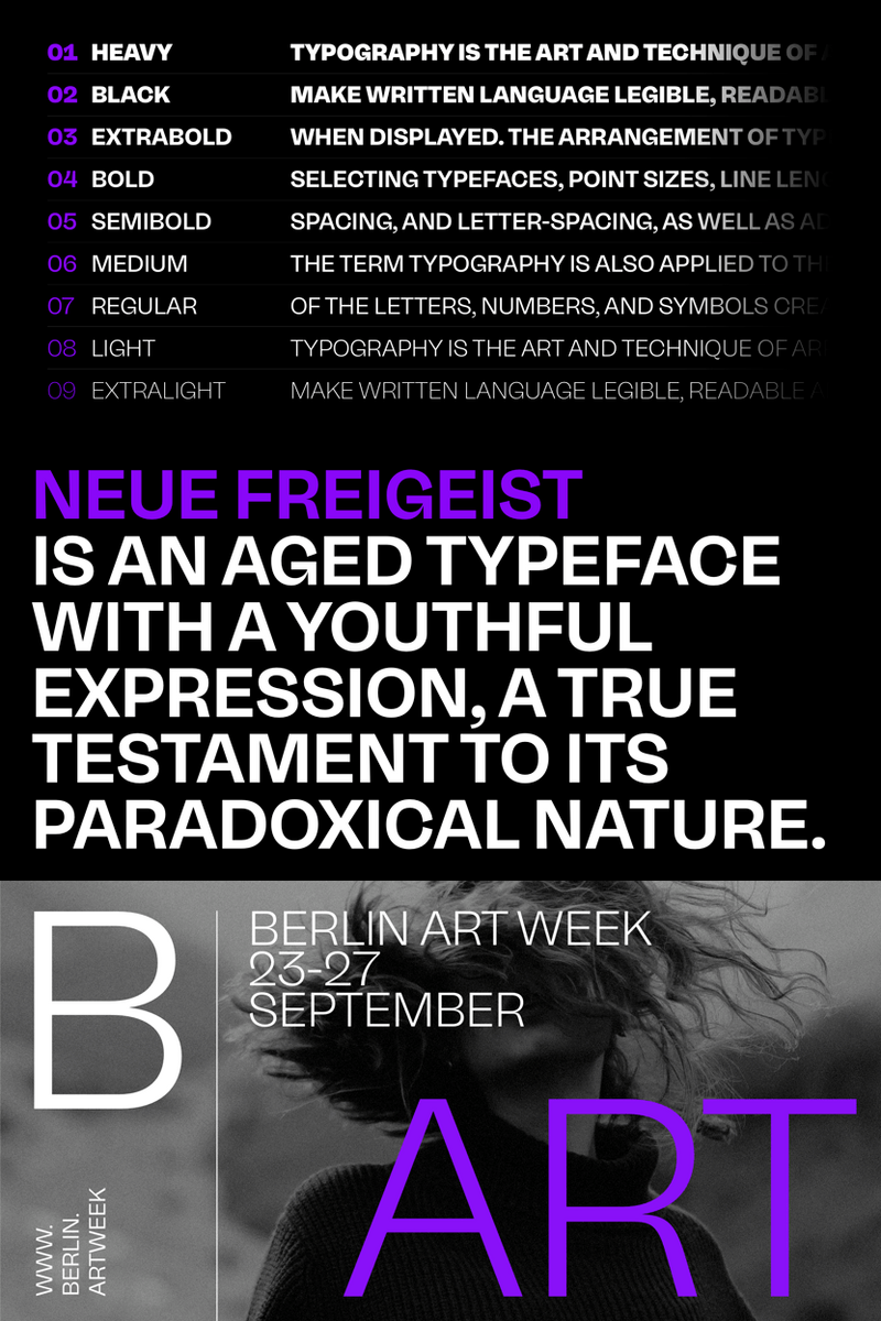
Unleash Your Brand's Organic Soul: How Neue Freigeist Transforms Website Headlines (Like 'Embrace Your Glow' or 'Nature's Wisdom') for Lifestyle & Wellness Impact

Are you pouring your heart into a brand that nurtures, inspires, and heals, only to find your visual voice falling flat? In a world craving authenticity and natural connection, generic fonts just won't cut it. Your lifestyle or wellness brand deserves typography that breathes, flows, and resonates with the very essence of your mission.

Get ready to meet Neue Freigeist, the groundbreaking font designed to infuse your brand with unparalleled organic vitality! Imagine a font that doesn't just display words, but evokes feelings – the tranquil peace of a forest bath, the invigorating crispness of a morning walk, the comforting warmth of sun-kissed skin. Neue Freigeist captures that elusive, natural elegance with its gracefully flowing forms, perfectly balanced curves, and a subtle, handcrafted warmth that feels undeniably real. It's a font that whispers authenticity and sings with vibrant life, perfect for your holistic vision.

You curate experiences that nourish body, mind, and spirit. Now, let Neue Freigeist be the visual cornerstone that amplifies your message. This isn't just a font; it's a bridge to deeper connection with your audience. Think about those crucial first impressions: a website headline that instantly conveys your brand's commitment to wellness, a product label that feels as pure as its ingredients, or a social media graphic that invites genuine engagement.

Neue Freigeist empowers your brand to:

  • Forge Authentic Connections: Its organic feel immediately signals trust and genuine care, building a heartfelt bond with your audience that generic fonts can only dream of.
  • Radiate Natural Vibrancy: Stand out in a crowded market with a distinct visual identity that reflects the purity and vitality of your offerings. Every letter feels alive, making your content irresistible.
  • Inspire Action with Emotional Resonance: Whether it's a website headline like "Mindful Movement," "Pure Living Essentials," or "Cultivate Your Calm," Neue Freigeist ensures your words carry maximum impact, inviting your audience to dive deeper into your world.
  • Harmonize Your Visual Story: From your soothing blog posts to your invigorating event promotions, Neue Freigeist offers a versatile, cohesive aesthetic that ties every touchpoint of your brand together with natural grace.

Neue Freigeist is more than a typeface; it’s a commitment to your brand’s holistic presence. Use it for captivating website headlines, inviting body text, soul-stirring social media graphics, elegant product packaging for organic teas or skincare, engaging app interfaces, and tranquil print materials. Let every word resonate with the natural harmony your brand embodies.

Neue Freigeist: Where Your Brand's Essence Takes Form.

Ready to transform your brand's visual narrative? Discover the powerful impact of authentic, organic typography. Learn more about Neue Freigeist and experience the difference it can make for your lifestyle and wellness brand.

Add this font to your collection!

Unleash Your Brand's Organic Soul: How Neue Freigeist Transforms Website Headlines (Like 'Embrace Your Glow' or 'Nature's Wisdom') for Lifestyle & Wellness Impact
Start using this font today!

Rusdane: Is Its Hyper-Minimalist Core the Blueprint for Your App's Next-Gen Brand Identity, from 'Sync' to 'Stream'?

In a digital ecosystem saturated with visual noise, where every pixel competes for attention, how do you design an app that speaks volumes w...