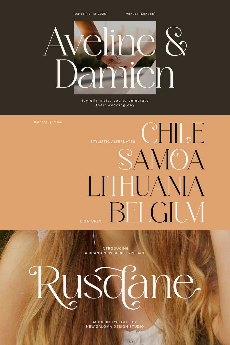
In a digital ecosystem saturated with visual noise, where every pixel competes for attention, how do you design an app that speaks volumes with eloquent silence? Mobile app designers constantly seek that elusive balance: compelling visual impact, intuitive user experience, and a brand voice that resonates without shouting. This is where Rusdane font enters the frame, not just as a typeface, but as a strategic design tool engineered for the future of mobile interfaces.
Meet Rusdane, the modern minimalist font precision-engineered for the digital frontier. Its core value proposition is clarity through refined simplicity. Imagine pristine, geometric lines that are subtly humanized by their perfect proportions, conveying a feeling of understated power and sophisticated calm. Rusdane doesn't just display text; it curates information, inviting users into an experience that feels intuitive, intelligent, and distinctly premium. It's the silent architecture behind exceptional UX, evoking a sense of calm efficiency and forward-thinking design.
For too long, app interfaces have struggled to convey profound brand identity without resorting to visual clutter. Generic typography often dilutes a carefully crafted aesthetic, leading to visual fatigue and a fragmented user experience. Rusdane disrupts this cycle. It integrates seamlessly into your digital canvas, allowing your content to breathe and your brand's essence to emerge with unparalleled focus. This isn't just about aesthetics; it's about optimizing the user journey, guiding the eye without distraction, and transforming your app's UI from merely functional to undeniably iconic.
Rusdane font delivers specific, tangible benefits directly to your mobile app projects:
- Pixel-Perfect Readability: Optimized for the smallest screens, Rusdane's crisp geometry ensures every character, from a nuanced legal disclaimer to a critical CTA, is impeccably clear and easy to digest, reducing cognitive load.
- Scalable Brand Impact: Its inherent versatility and clean design maintain visual integrity across all UI elements, from subtle microcopy to commanding navigation labels, forging a consistent and memorable brand identity that scales effortlessly.
- Future-Proof Aesthetic: Rusdane's timeless minimalism transcends fleeting trends, ensuring your app's design remains fresh, cutting-edge, and relevant for years to come, preserving the longevity of your digital product.
- Elevated User Experience: By stripping away the superfluous, Rusdane directs focus to essential content and interactions, creating a premium, sophisticated feel that enhances user engagement and fosters a frictionless experience.
Rusdane: The Future of Clarity.
Envision Rusdane illuminating your app's critical touchpoints: powering crisp navigation labels like 'Settings,' 'Profile,' or 'Discover'; bringing analytical data to life in a 'Live Metrics' dashboard; or reinforcing crucial actions on 'Launch' and 'Checkout' buttons. From the welcoming text of an onboarding flow to the streamlined communication of system messages, Rusdane instills confidence and elegance into every interaction.
Ready to infuse your app with the power of modern minimalism and a truly future-forward identity? Explore the full Rusdane font family. Visit our gallery and witness its transformative potential for your next-generation mobile app.